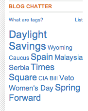
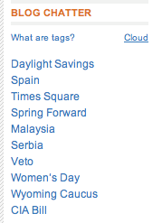
When we put together the SkillClouds proposal, we knew that we would need to think carefully about making SkillClouds accessible. I was very aware that tag clouds are a fundamentally visual approach to presenting information, and that we would therefore need to ensure we didn't exclude students with visual impairment from accessing skills information from our project.
I bumped into Pete Rainger at a Sussex Learning Networks event last month, and knowing that Pete in an e-learning and web accessibility specialist (find out more at his site http://www.key2access.co.uk/index.php), I discussed with him what issues he thought would be particularly important issues for the SkillClouds project to address.
Last week he got back to me with an incredibly helpful email, which I'm working my way through, and thought it would be useful to start blogging about here.
Pete raised two key accessibility issues. First of all, designing for screen readers. He sent me the link to an article - http://24ways.org/2006/marking-up-a-tag-cloud about ensuring that tag clouds can be made sense of by screen readers. Mark Norman Francis goes through a number of tag clouds and identifies the highs and lows of the html mark up used. Lots of good advice about keeping the html clean and semantically meaningful for screen readers.
The second issue that Pete raised was ensuring that students with dyslexia were able to access information from SkillClouds. He described tag clouds as being language heavy. From a dyslexic's point of view, I guess a tag cloud is a jumble of signs, with strong horizontal and vertical features, but also random patterning caused by the pattern of tags rendered in a large font. So scanning the cloud to find a particular tag may not be at all easy.
This makes me remember how much I want to do an eye-tracking study of tag cloud users, and how interesting it would be to ask people with dyslexia to participate in this.
This is a very good time to be reflecting on the email from Pete, because over the last week we have been piloting a usability experiment and ran a user-centred design session. It's emerging that the order of tags in the cloud is not obvious. For many users, in their initial encounters with a tag cloud, it looks like a jumble of tags.
Pete poses some interesting questions, particularly in relation to tag clouds with frequency represented by font size. He asks:
- whether we could use images instead of or as well as words
- if we could enable users to toggle between sort by frequency and sort alphabetically
- whether using colour as well as size could help with the display


(Not quite sure what the order of these tags is ..)
There's a lot more in Pete's email, which I'll return to in further posts.


No comments:
Post a Comment